Building a federal front door for vaccinations
Recently, a friend of mine shared how she was able to get COVID-19 vaccination appointments for her parents.
I finally got my parents appointments by logging in to CVS.com at 2 AM and hitting refresh on 15 ZIP Codes over the course of 90 minutes based on one Reddit comment I read. This is remarkably disheartening.
We’ve all heard similar stories. Our local and state governments are struggling to deliver effective digital services to their constituents seeking vaccinations. People are most often presented with inconsistent, confusing, and contradictory information that can lead to cognitive overload during an already stressful interaction.
A better way is for the federal government to provide a single COVID-19 vaccination website with consistent information about when people can get the vaccine, where, and at what cost. This website should go beyond providing accurate information to help people take action and sign up for a vaccination.
In our discussions with state governments and our explorations of the issues surrounding vaccinations, we’ve landed on a handful of principles that could shape a federal vaccination website and core features the website should provide on launch. These principles are grounded in our work creating action-oriented digital experiences for federal websites including HealthCare.gov, Medicare.gov, VA.gov, and more.
Principles
Simple
The website must be simple from top to bottom. That starts with using proven, trusted components and infrastructure to make the site easy to change, maintain, and troubleshoot. This simplicity must continue into the design, content, and interactions.
Built for demand
A perennial source of frustration with state and local vaccination scheduling websites has been sites going down under heavy demand. A national site would certainly face a tremendous amount of demand, which is why the site would need to use scalable cloud infrastructure to ensure it was ready to handle the traffic.
Action-oriented with no wrong doors or dead ends
A first principle of the user flow should be that users are never left at a dead end or brought out of the path to their destination. Too many sites do not provide accurate, up-to-date information, or they leave users at a screen saying all vaccination slots are full. Making the site action-oriented would ensure people can preregister, check their eligibility and status, sign up for notifications, and find whatever additional information they may need.
Plain language
Right now, many sites put the burden of determining eligibility on the user, often with complex language. Here’s an example:
...to increase vaccine access in the state to those who have been disproportionately burdened by the effects of the pandemic, eligibility groups will be prioritized first by specific groups, then based on persons experiencing health inequities who live in the top third of census tracts and who have pre-registered.
Language like this increases the mental burden of people already working through a stressful interaction. A federal vaccination website should use plain language about every aspect of vaccinations and could build off existing COVID-19 plain language best practices.
Accessible
Beyond ensuring the site content is accessible to people with different English levels, the website should also work on as many devices as possible and work for everyone. That means meeting or exceeding the Web Content Accessibility Guidelines (WCAG) version 2.1. Whitehouse.gov has pushed toward this standard, and this site should follow suit. But it should not conform to standards only. People with disabilities should participate in the design process. Having their feedback makes it possible to build a site that goes beyond compliance. Lastly, it should follow the principle of progressive enhancement. Registration can still happen even if someone has a poor internet connection. The site should also be translated into multiple languages so people can complete the process without assistance. That’s all to say, it should work no matter the device, situation, or background a person brings to it.
Features
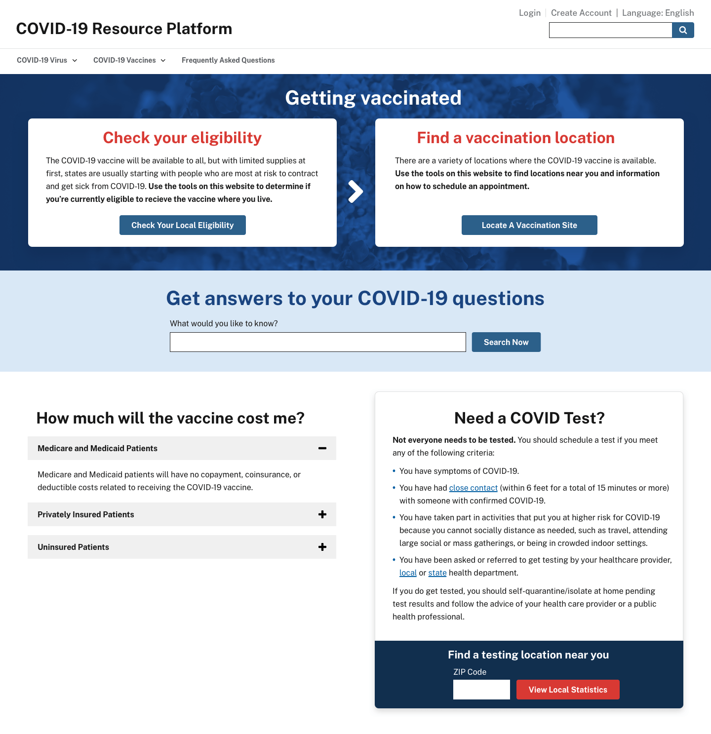
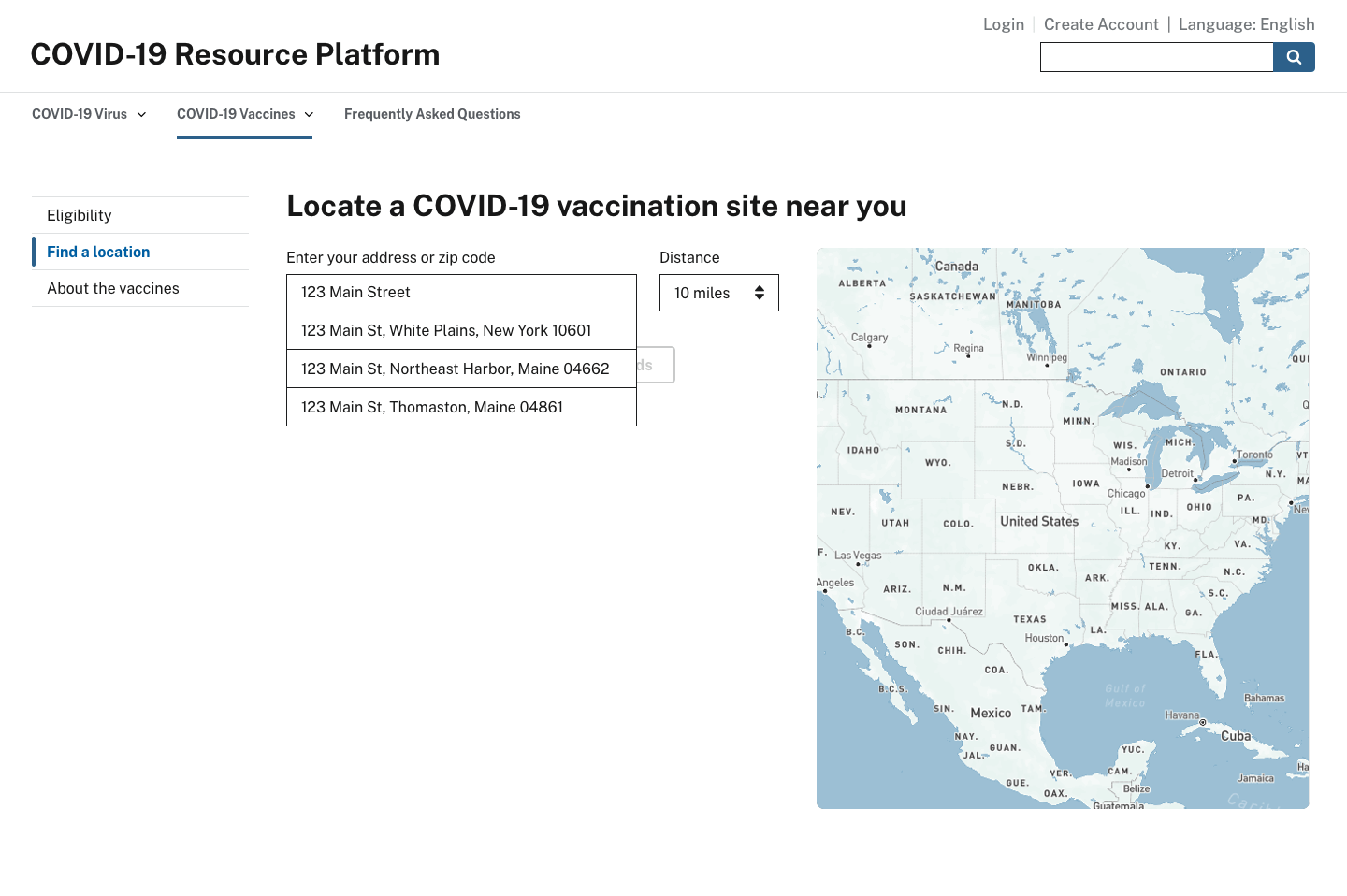
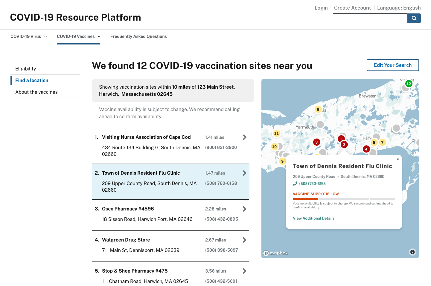
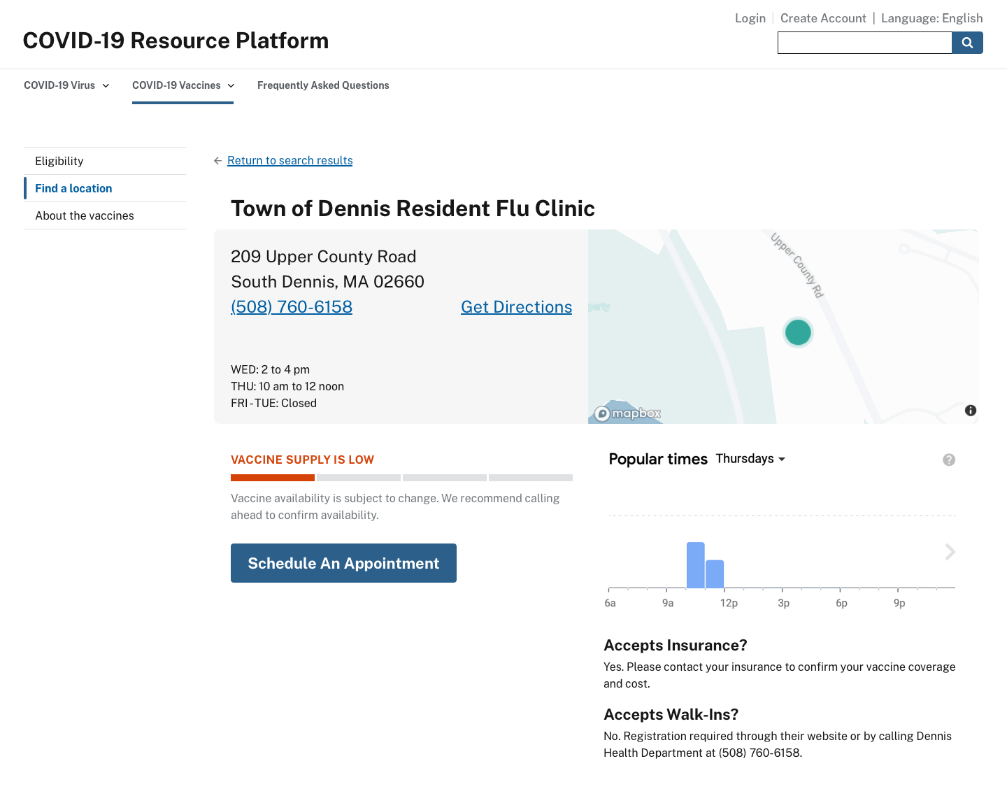
A COVID-19 vaccination website run by the federal government should have core features that meet high-value needs and a clear user experience that moves people from information to action. Our team has created mockups that show how a federal site could help people get vaccinated. People want to know if they’re eligible, and if so, where they can get vaccinated. Both of these workflows are placed prominently on the home page mockup and take the user immediately to the corresponding actionable workflows shown below. Two additional frequently asked questions are related to vaccine cost, and where people can get tested. People can also use the prominent search bar to find other information.
Eligibility determination
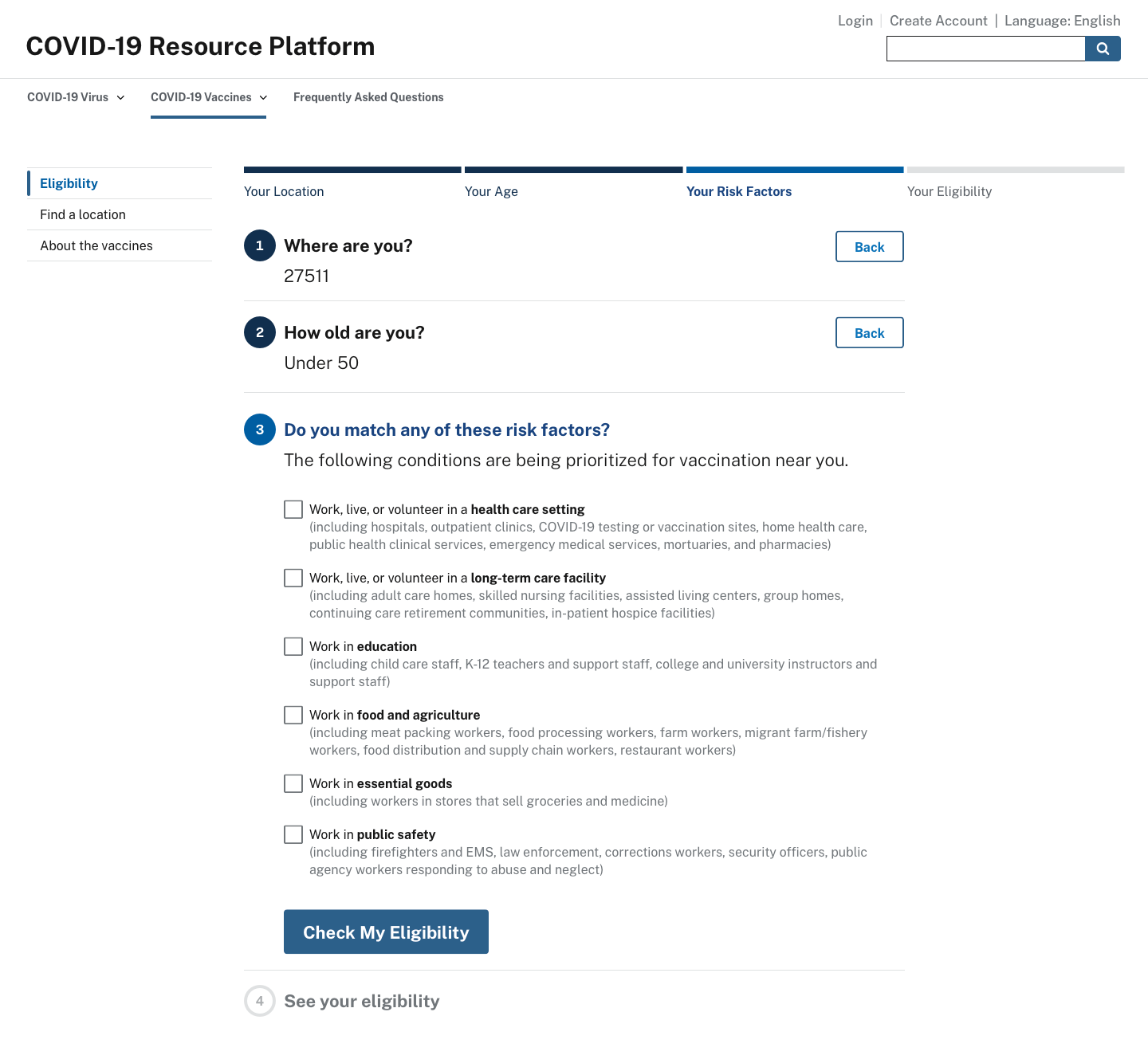
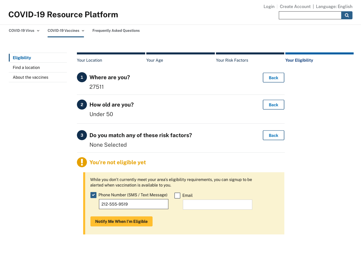
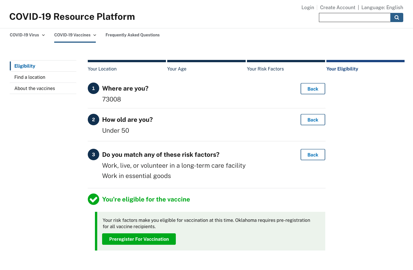
Eligibility for a vaccination is determined by several conditions, such as age and risk factors, and each state sets their criteria differently. As Ad Hoc’s CTO recently posted, states should not “assume that users know where they fall into your jurisdiction’s phased vaccination allocation scheme. Low-information users and even users who have been following the news closely may not know the precise eligibility criteria of each phase.” The mock-ups below show how the federal front door could use ZIP Codes to provide people with eligibility status based on the rules of their state.
Preregistration
A centralized website should allow everyone in the country to preregister for the vaccine. Right now, the vast majority of states do not have a preregistration option for vaccination. News outlets are publishing state-by-state guides, but most of those have descriptions similar to this one: “The state site says that there is ‘no specific timetable’ for when members of the public can be vaccinated and does not offer an option for the public to preregister for the vaccine.”
Preregistration allows residents to save their place in line based on eligibility. If a federal website implements the eligibility determination described above, it could serve as the initial data-gathering steps of preregistration.
While a single federal website would be the best experience for users, some states may not want to participate in a centralized system. For those states, the federal website could create a customizable “template” with the full range of pre-registration options for states to use and create their own websites. This would provide several benefits, including reducing the website development work for each state and creating a consistent experience across federal and state websites.
Find a location
When the user receives a notification that they’re eligible to get the vaccine, the website should present them with their nearest vaccination options. When they select a site, they could then contact it to schedule their vaccination appointment.
Conclusion
Vaccinating the entire country is a major public health campaign that requires a coherent digital strategy. At the core of this strategy should be an easy-to-use, centralized COVID-19 vaccination website, with the core principles and features that we describe above, to provide people with what they need to get their vaccination. If this were in place, it would remove digital barriers to getting the vaccine and speed the nation-wide rollout.
Mockup images by Mike Gibson.